
The Children's Trust
|
2024

Company
The Children's Trust
My Role
Lead Product Designer
Timeline
2023-2024
Responsibilities
UX Strategy, Design System, Accessibility, Research, Collaboration
Overview
This redesign for The Children’s Trust transformed a dated, inaccessible government website into a clean, accessible, and highly navigable digital experience spanning over 70+ content-rich pages. With a strong foundation in UX Strategy, Design System thinking, Accessibility, Research, and Cross-functional Collaboration, the project centralized vital services for families and providers while aligning with WCAG 2.1 AA standards. Every touchpoint was redesigned for clarity, usability, and long-term scalability—driven by real-world user needs and rigorous stakeholder feedback.
Auditing the Old to Inform the New
To lay the foundation for a successful redesign, I conducted a full audit of The Children’s Trust’s existing website. I mapped out everything from color usage and typography to layout patterns and navigation logic. Using this evaluation, I documented the gaps and inefficiencies in the system — including accessibility issues, visual inconsistencies, and redundant page structures. These early insights shaped the strategy for a modular design system and allowed me to prioritize what truly needed to change.
Design System Thinking: From Audit to Architecture
After identifying the visual and structural inconsistencies of the old site, I began building a flexible design system that could scale across 70+ pages and serve two distinct user groups. Every element — from buttons and forms to accordions and carousels — was defined with accessibility and modularity in mind. I created a comprehensive inventory of components and documented how they should behave across various contexts and content types. What’s shown here is just a glimpse of the full system — a working foundation that enabled consistency, accelerated development, and aligned the team around a shared design language.
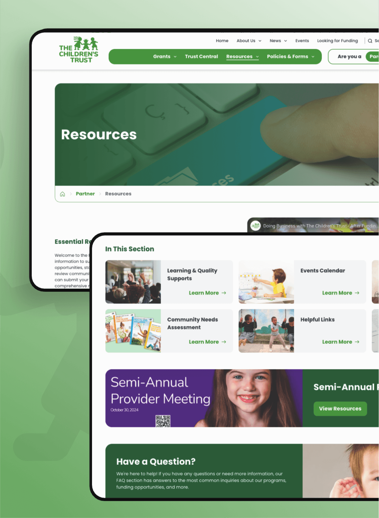
Dual Experiences, One Unified System
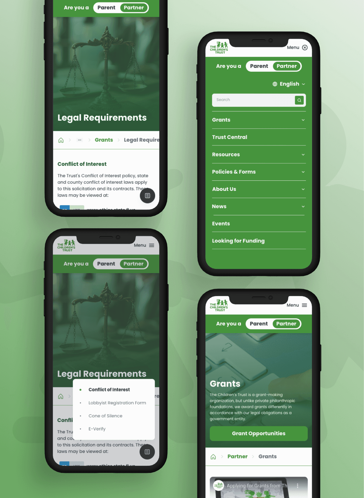
As the sole designer, I also introduced the idea of color-coding the two core user journeys: green for Partners, who manage programs and funding, and blue for Parents, who are looking for support and services. While both groups use the same platform, they access very different parts of the site — with different content, goals, and UX needs. By embedding this distinction into the design system itself, I was able to create two tailored experiences under a single cohesive brand. Components were structured to be flexible but intentional, so they could adapt contextually while maintaining accessibility and clarity across the board.
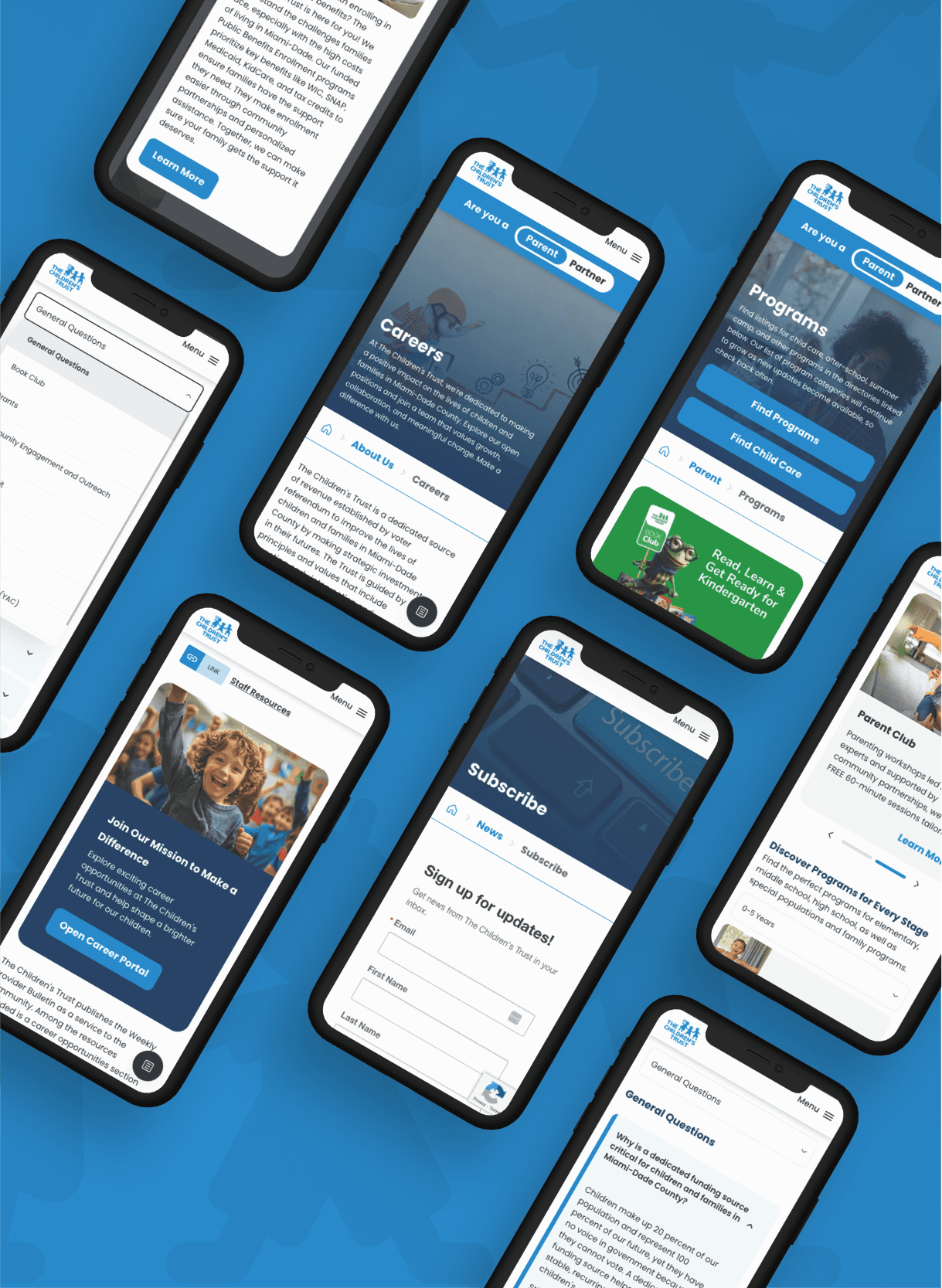
Designing for Every Screen, Without Compromise
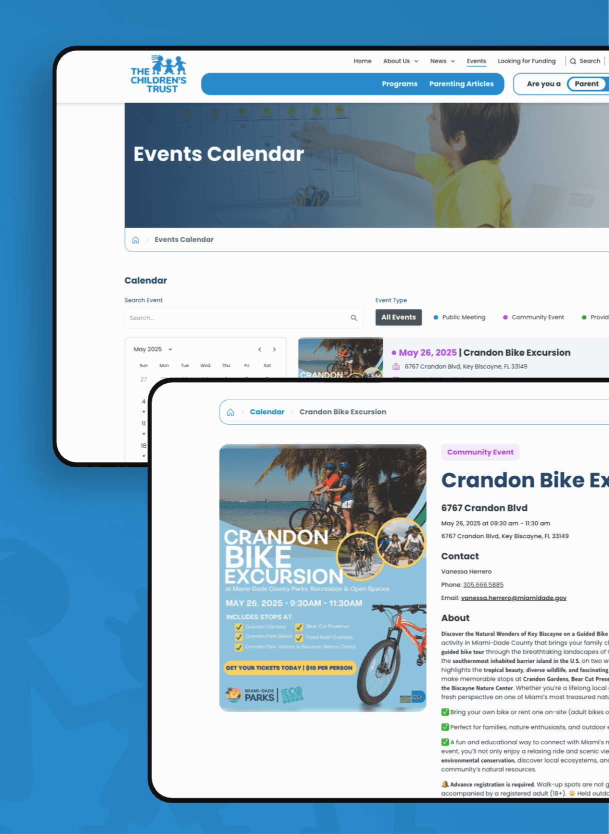
Knowing that parents and partners would access the site on everything from desktops at work to mobile phones on the go, I prioritized a responsive design system that adapted cleanly to all screen sizes. I tested layouts across breakpoints early and often, refining how content stacked, how navigation collapsed, and how visual hierarchy held together in constrained spaces. The goal wasn’t just to make the site work on mobile — it was to ensure the experience felt just as thoughtful, accessible, and intuitive whether viewed on a laptop, tablet, or phone. That adaptability was essential to reaching users where they are and delivering equity through design.
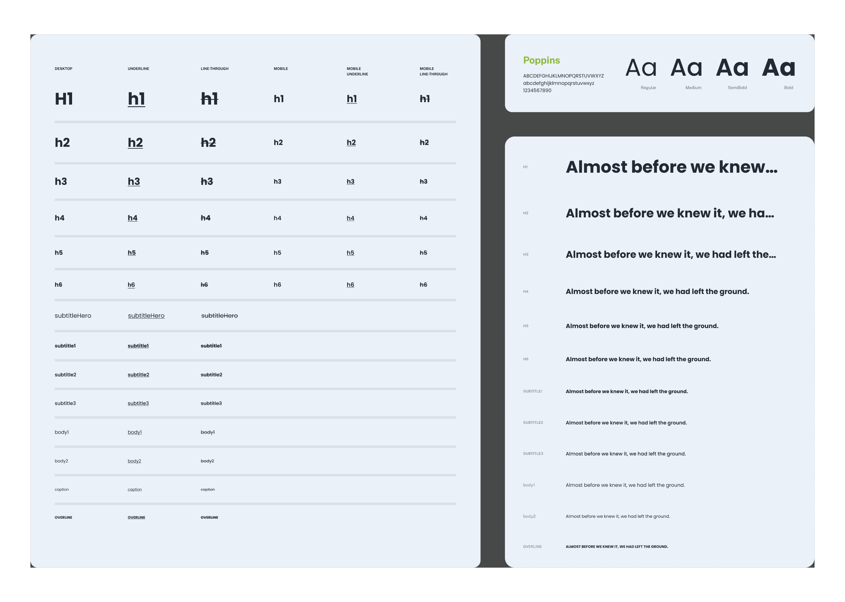

Crafting a Tone of Clarity, Trust, and Inclusion
To reflect the mission of The Children’s Trust, I built a visual language rooted in empathy, accessibility, and warmth. I selected Poppins for its approachable geometry and strong legibility across all sizes, then established a typography scale that reinforced hierarchy without overwhelming users. I also designed a broad, accessible color system — including high-contrast UI neutrals, vibrant primary tones, and audience-specific accents (green for partners, blue for parents). These foundational choices helped me strike the right balance: a design system that was inclusive and child-friendly, but also professional enough to support civic-level trust.
Bringing It All Together in the Final Experience
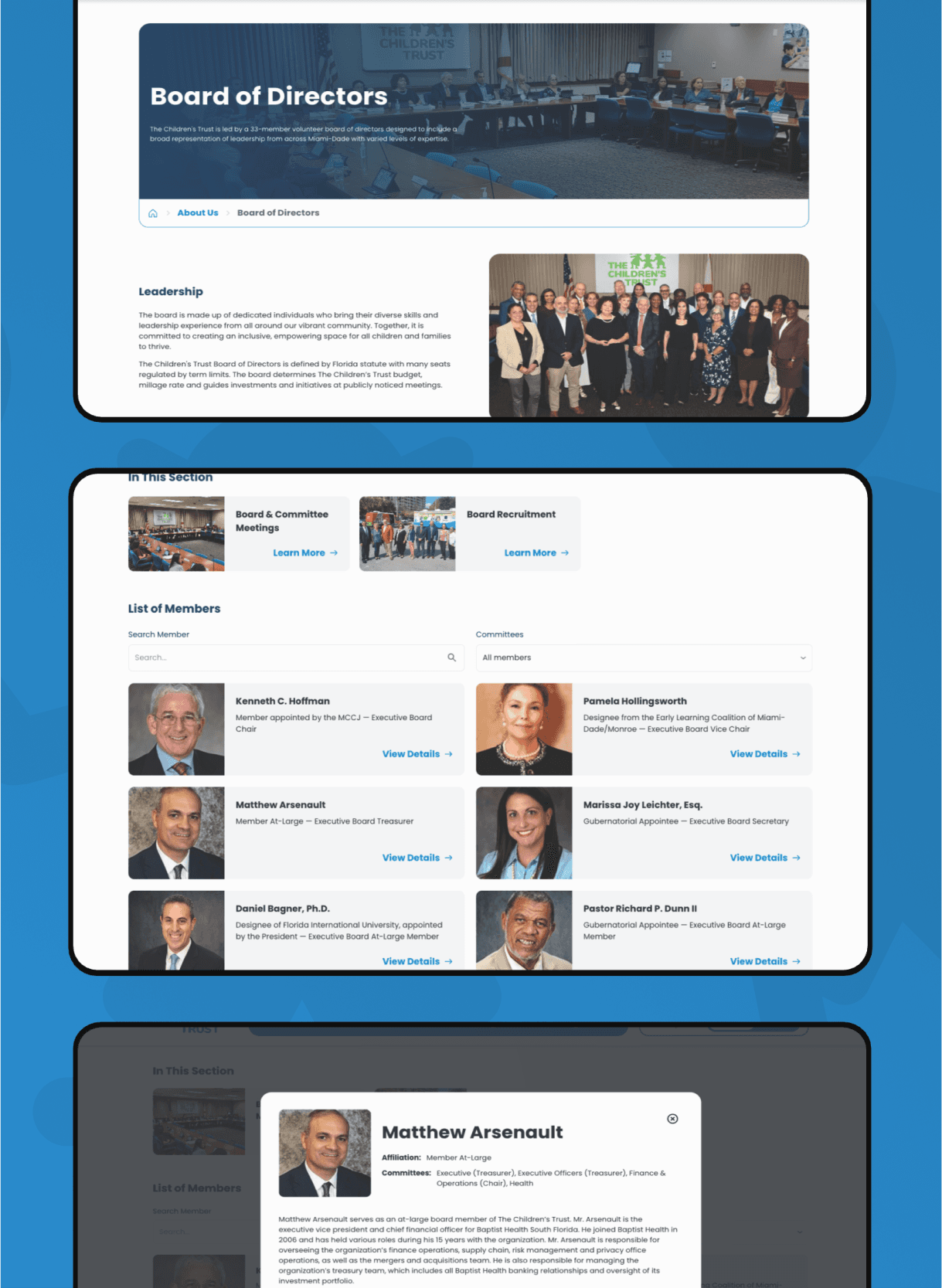
This is where all the foundational design work came to life. I translated the system into high-utility, user-first screens — from program directories and events calendars to resource hubs and mobile-friendly layouts. Each section was designed with clarity and intent, adapting to the specific needs of parents and partners while staying cohesive across the platform. I focused on creating patterns that scaled visually but also solved real problems, like helping users find events quickly, access board information efficiently, or navigate services on the go. Every screen shown here is the result of decisions grounded in accessibility, tone, and user empathy.

The Outcome
The final website launched fully responsive, WCAG-compliant, and built on a modular system ready to scale. As the sole designer, I led the visual and UX transformation from a dated, bureaucratic interface to a warm, intuitive, and human-centered experience. Feedback from both internal stakeholders and the public has been overwhelmingly positive — parents are finding resources faster, and partners are navigating tools with less friction. What was once disjointed is now unified, accessible, and aligned with The Children’s Trust’s mission to serve the families and communities of Miami-Dade.
Key Insight one
Accessibility isn’t a checklist; it’s a mindset baked into every decision from font choice to structure.
Key Insight two
Modular components aren’t a nice-to-have—they are how you ship 70+ pages in pace with dev.
Key Insight three
Less friction equals more trust. A government website can feel friendly without sacrificing credibility.
Key Insight four
Regular feedback loops allowed us to address concerns early, build trust, and keep quality high.
NEXT PROJECT
Go to Next Project
Take me back home

 Get in touch